
Loveable Witnesses,
I write to you from beyond the grave. Over here... just beyond this one. Does it have a darling tongue-in-cheek rhyme scheme describing the sordid details of the interred's final moments? No — this is not some entertainment corpse's attempt at family-friendly macabre. It just says a name and some dates. Maybe a comment about their loved ones. Ghastly.
There's a certain joie de vivre about etched word serifed thusly. No roboto here, love. If there is a grave with Calibri scrawled across it, well it is no grave of mine. And god help the soul interred beneath Impact. That is not a burial but a punchline.
The design choices of written word is a silent killer. It can evoke just as much reaction as the intentions relayed by the texts themselves. These 'fonts' as we've come to know them are as critical as the brainpower necessary to dribble out your next diatribe about the slithering evils in the dark among the stars. Do it in comic sans, motherfucker, I dare you.
Consider: you spend three weeks lovingly crafting an adventure about a coastal town where the fishermen have been returning as different people. Maybe something is in the water or wears a familiar face but inhabits it like a child in their father's coat. The prose drips with dread. And then you set the whole thing in Arial. Arial! The font of dentist office appointment reminders and human resources memos. Your fishermen deserve better. Your readers deserve better. Frankly, you deserve better.
Typography is not decoration. It is the first impression your words make before they have said anything at all. It is the difference between a reader leaning in and a reader clicking away to look at pictures of someone's festering sores. It communicates before it communicates, if you follow me — which you should, because you are witnesses, and witnessing is your whole thing.
So, without much additional ado — always so much ado these days — I would like to outline some of my favorites. I am a font freak, after all, and what would a font freak be without a little voyeurism.
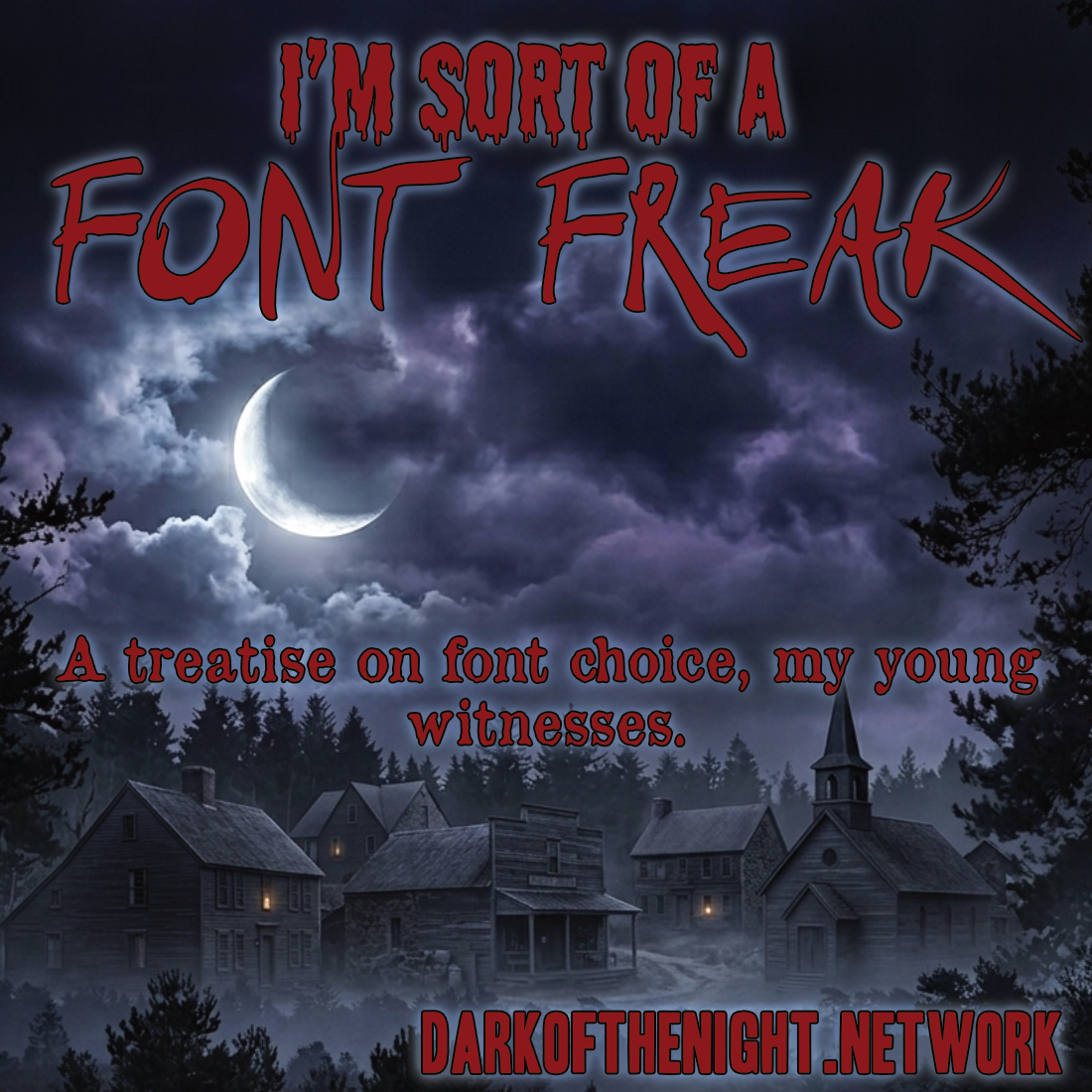
1. Toronto Gothic
I would be remiss if I didn't serve my own soup here. When people think newspapers, they think Futura or News Gothic or some other sort of Gothic one would find up tall cathedrals ringing bells and screeching. Toronto Gothic is the tabloid title font of subjects of fright. 'MAN-STRANGLER FOUND STRANGLING MAN — STILL AT LARGE.' 'PINE BARRENS BODY FOUND — FOURTH THIS WEEK.' The letters look hastily stamped on the newsprint like the newspaper-men themselves might be on the run.
It has the authentic anxiety of a headline that had to go to print before anyone was entirely sure of the facts. Which, if you are writing horror, is precisely the energy you want. Your readers should feel that whoever put this together was in such hurry that they may not have finished the job.
Where I've Used It: On this site, no less.
Link: FontBros
Note: Headline HPLHS One may have better kerning and is free — worth the comparison before you commit.
2. Shlop
I know, ok. It looks, well, shloppy. Like a child's first choice at wanting to write the word "kill" in their notebook. Practically crayon-adjacent.
But it has a sort of pizazz itself, witnesses. It conveys that early 60s creature-feature all the way to the 80s slasher-fest where it may have eventually merged with the sharpened-edge steel of RoboCop or Terminator. Around the time we figured out the scariest things weren't hiding just beyond the treeline but were probably investing in robots. Shlop lives in that transition — one foot in the rubber monster suit, one foot in the chrome nightmare, looking genuinely delighted about all of it.
The trick with Shlop is that it makes horror fun, which is a legitimate subgenre. Not everything needs to be Ligeia. Sometimes a man in a bad mask is chasing teenagers and everyone is having a great time except the teenagers.
Where I've Used It: Splatterhaus is my main label and I've incomprehensibly tied it to the font. Like a madman, no less.
Link: DaFont
3. Fright Night
This is a thing for camp sites? I mean that earnestly — there is something about Fright Night that evokes a hand-painted sign nailed to a wooden post at the entrance to a corn maze.
FRIGHT NIGHT: $8 ADULTS $5 CHILDREN UNDER 12.
Which is either the lamest thing possible or absolutely the most terrifying thing possible depending on what is at the end of that corn maze and how it was priced per head.
The font commits to the bit like wearing a Halloween costume in July. For the right project — something that leans into camp, something that knows it is ridiculous and loves itself for it — Fright Night is the correct and only choice.
Where I've Used It: Haven't.
Link: DaFont
4. Let Der B Carnage!!!
What's in a name, really?
The name Let Der B Carnage does not leave room for ambiguity about the intended use case. It is not suggesting carnage or implying the possibility of carnage under certain conditions. It has made a decision and that decision is carnage, announced with three exclamation points that themselves look slightly deranged, which is appropriate because we are past the point of composure.
The font itself follows through on the threat. It is aggressive in the specific way of something that has been pushed too far and has now fully committed. Good for titles or anything where you need the reader to understand immediately that things are going to get worse before they get better or not get better.
Where I've Used It: Saugatuck State, a supplement that I haven't released yet.
Link: DaFont
5. Old Newspaper Types
Old Newspaper Types is the journalistic fossil record. It reads like a broadsheet that has been left in a basement for sixty years and has acquired, through the simple act of survival, a certain grim authority. The ink looks slightly uneven. The letters suggest a press that was running a little hot and haunted by the stories it had been asked to carry.
For horror, for mystery, for anything that benefits from the suggestion of documentation — that this terrible thing was written down by someone who felt it needed to be recorded before they too were lost to whatever they were recording — Old Newspaper Types is doing the work before the text even begins.
Where I've Used It: Sunscream's title is written in this and that, my witnesses, is the best I can offer. Some fonts speak for themselves.
Link: DaFont
That's the list for now, witnesses. There will be more — that is the nature of the affliction. But a freak must pace themselves or they lose the thread entirely and end up three hours deep into a foundry website at 2am having purchased nothing.